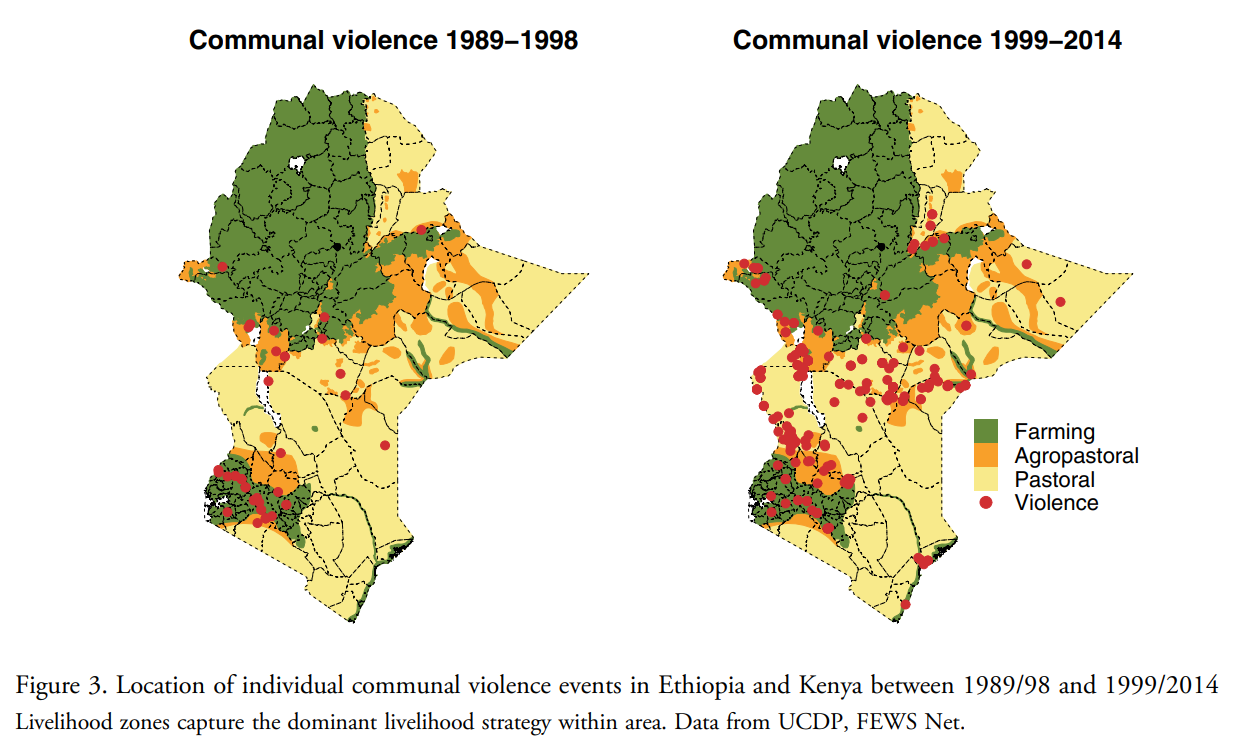
Source: van Weezel S. "On climate and conflict: Precipitation decline and communal conflict in Ethiopia and Kenya." Journal of Peace Research. 2019;56(4):514--528.
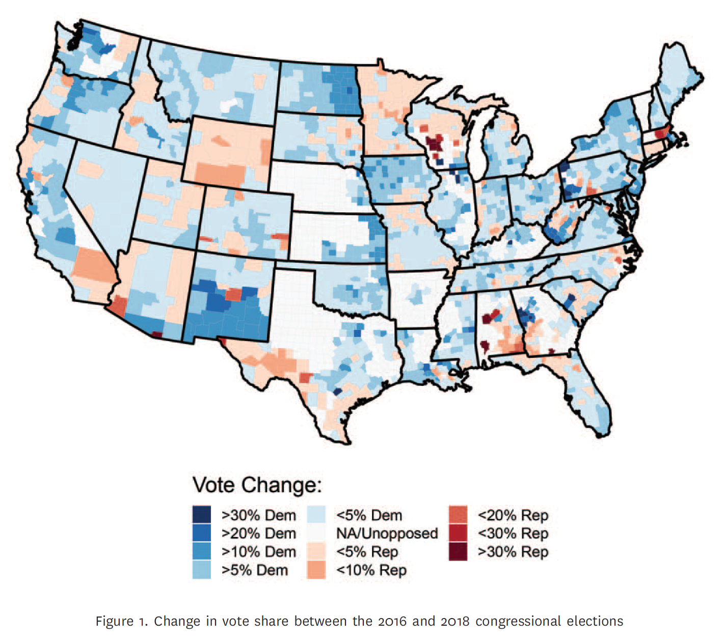
Source: Chyzh, Olga V. and R. Urbatsch. 2021. "Bean Counters: The Effect of Soy Tariffs on Change in Republican Vote Share Between the 2016 and 2018 Elections."Journal of Politics 83 (1): 415--419.
A Basin (Rather Hideous) Map
library(ggplot2)ggplot() + geom_path(data=states, aes(x=long, y=lat, group=group),color="black", size=.5)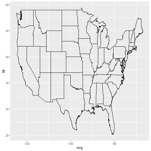
Polygon instead of Path
ggplot() + geom_polygon(data=states, aes(x=long, y=lat, group=group),color="black", size=.5)+ coord_map()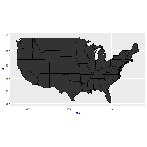
Plot the Regions
ggplot() + geom_polygon(data=states.class.map, aes(x=long, y=lat, group=group, fill = StateGroups), colour = I("black"))+ coord_map()+theme(legend.position="bottom")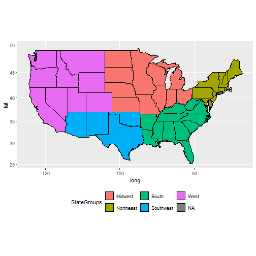
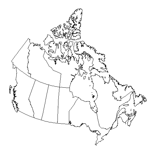
Map of Canada
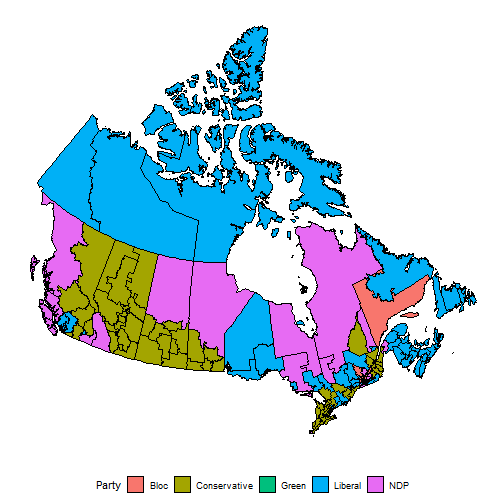
Canada Election Results
Your Turn
Check out the help file for the
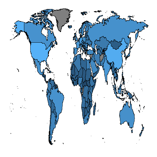
map_datafunction to find out how to make a map of the world.Can you figure out how to remove Antarctica from the map?
Use the GDP data you scraped as part of our web-scraping class to shade countries based on their GDP.
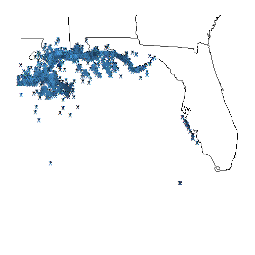
Your Turn (Advanced)
- Read in the animal.csv data:
- Plot the location of animal sightings on a map of the region
- On this plot, try to color points by class of animal and/or status of animal
- Use color to indicate time.